


As I’ve mentioned recently, I’m working on standing up a new community in a new role. And despite nearly 20 years of being in the community space one way or another, I have to remind myself that these days landing pages just don’t matter like they used to. Design doesn’t matter like it used to. And while it makes the creative side of my community nerd brain a little sad, I get it. (And then I still put like 30% more effort into the landing page because old habits die hard and all that.)
But anyways.
Not only have I built a lot of community launch decks, but I’ve sat through probably 50x as many community decks from platform vendors, other communities, and more. And more than a small handful have a similar slide: a stunning landing page, a big ol’ friendly button that invites users to join, and someone excitedly explaining onboarding functionality like it’s the only way anyone will ever arrive. One door. One hallway. One version of hello.
That was never fully true, but it’s now catastrophically untrue. Someone finds your community through a Google search that dumps them straight into a three year old thread about a bug that was fixed two releases ago. Someone else asks an AI assistant a question and gets a paraphrased answer with a link buried at the bottom, if they get a link at all. A third person hears about you at a conference bar because a colleague name dropped your forum while complaining about something unrelated. Three people, three completely different rooms, and you designed a reception for… well… none of them.
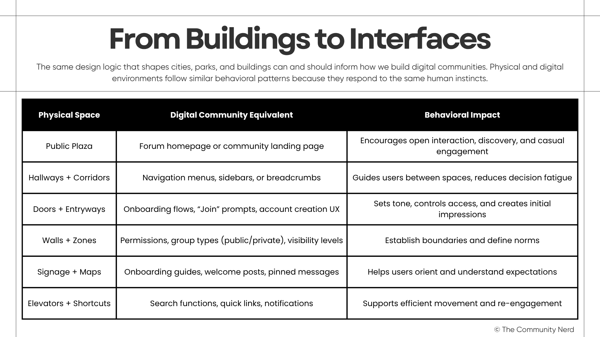
I gave a talk last year about how architectural principles shape human experience across physical and digital environments, and I keep coming back to it because it maps onto this almost too cleanly.
A front door isn’t just an opening in a wall. It’s a invitation. You walk in, there’s a reception, maybe some much needed information, and a beat where your eyes adjust and your nervous system registers I am allowed to be here. Then you’re guided toward wherever you’re actually going via hallways, corridors, walls, signage, and more. And that’s truly just grand if you need that experience.
Now let’s say you already know this place and you know exactly where you want to go. You know there’s a side door that takes you right to where you want to be. Also truly grand.
But both of those are very intentional behaviors. You entered the space with a desired outcome; the first with exploration and the second with direction.
So now let’s say you didn’t see the front door, grabbed the handle of the side door. And the side door just skipped all of that ‘truly grand’ stuff from above. It drops you straight into the kitchen mid dinner party; no reception, no adjustment beat, just you and a room full of context you don’t have.
Uh… am I allowed to be here?
Search and AI summaries are side doors. They don’t route people through your front door and to reception. They drop them into a specific room, mid conversation, and expect that room to make sense on its own. So does it?
Most communities have spent a decade perfecting the front door and completely ignoring what happens at the side entrances.
That’s the thesis, and it’s worth sitting with, because it explains a specific kind of failure you’ve probably felt but not named: the sense that your community’s best content, the stuff that actually converts curiosity into belonging, gets buried three clicks deep, while a half baked thread with a so-so title is quietly doing the work of your entire acquisition funnel.
So what does it actually mean to design for three doors instead of one.
Your reception content (the landing page, the welcome thread, the about page) still matters, but it’s no longer your primary entrance. Its job shifts from persuasion to orientation: helping someone who’s already inside find their bearings, not convincing a stranger to walk through the wall.
Your side door content, the stuff that gets surfaced by search or scraped into an AI answer, has to work as a complete room. No hallway, no reception, no assumed context. A piece of knowledge that can’t stand alone and still be true, still be useful to someone who has never heard of your community, is not going to survive being extracted. Write for the person who arrives with zero reception.
Word of mouth is its own kind of door, and it’s the one most people forget is architectural at all. Someone vouched for you before the visitor ever showed up, which means the visitor is walking in with trust already extended on your behalf. Over explaining insults that trust. Under delivering breaks it. The room needs to be exactly as good as the person who recommended it implied it would be: no more theatrical, no less substantial.
The part that’s genuinely uncomfortable if you’ve spent years optimizing a single funnel: you don’t get to choose which door most people use anymore. The AI summary door is only going to get busier. The side entrances outnumber the front one now, probably permanently, which means the room by room experience of your community matters more than the building’s facade ever did.
I still love a good reception. First impressions matter and that the welcome experience deserves real design attention. But if every door except the front one drops a stranger into an unfurnished room with no context and no signage, the reception as entry point never mattered. It was just the door you happened to be standing at when you built the place.
Go check your side doors. I promise you’ll find at least one room with the lights off and nobody there to make sense of the chaos.